Consistently reproduce colour in your photography.
In its simplest form, colour management is the process of balancing your monitor to achieve colour consistency between your display and final print output. The end goal is to have images displayed on your screen more closely match the final printed product.
Follow the steps in the steps below to achieve more consistent results across your screen and final print output.
- Step 1 – Monitor Calibration
- Step 2 – File Format & Colour Space
- Step 3 – Test Prints
STEP 1 – MONITOR CALIBRATION
Option A: The first step towards achieving colour consistency between your screen and final prints is using a monitor calibration device, such as Spyder or X-Rite’s Color Checker, to calibrate your screen.
Calibration devices attach to the front of your monitor and analyse a series of colours and grey levels displayed on your screen via the device’s software.
Often the most prominent issue seen in uncalibrated screens is the brightness being set too high under default factory settings, meaning that the final print output appears to significantly darker in comparison. One of the primary goals of a calibration device is to set a more appropriate screen brightness.
More advanced devices also measure your room’s ambient light levels to adjust the brightness, further helping to avoid prints which appear too dark when compared side-by-side in the same lighting environment and conditions.
Using the readings taken during the calibration process, the calibration software creates a colour profile which instructs your screen to render each colour in a way that will match the print output.
N.B. Although all monitors can be calibrated to at least a basic level the accuracy of the results will vary depending on the quality of your screen. A low-quality, budget monitor which has been calibrated will still provide sub-par results. Common recommendations for colour critical work include Eizo, NEC and Dell’s UltraSharp models. It is important to note that even the best screens will still need to be calibrated.
Option B: Alternatively, you can calibrate your screen using the Calibration print (available to order via the DPP software and/or in-store) and compare it with the digital version of the print on your screen. While changing your screen settings via the menu button on the screen, compare the 2 versions until the digital version and printed are as close as possible to matching.
To ensure the correct results, make sure your room’s ambient light levels stay consistent.
STEP 2 – FILE FORMAT & COLOUR SPACE
It is essential to ensure your images are in the appropriate format before placing and order with ProLAB. All images should be high-quality 8-bit JPEGs either the sRGB colour space.
Lightroom Export Settings

We would recommend creating and saving an Export Preset using the following settings for future print use.
Recommended Settings:
- Image Format: ProLAB accepts JPEG files only
- Colour Space: sRGB
- Quality: ‘100’ to preserve full image quality
- Resize to Fit: Ensure this is uncheckedto preserve maximum quality
- Don’t Enlarge: Ensure this is uncheckedto preserve maximum quality
- Sharpen For: Print
Photoshop Export Settings
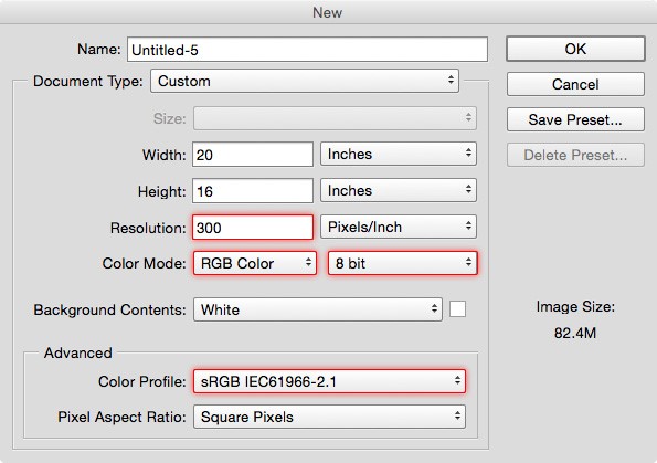
We would recommend creating documents using the following settings for future print use.
- Image Resolution: 300 Pixels/Inch
- Color Mode: RGB Color / 8 bit
- Color Profile: sRGB IEC61966-2.1
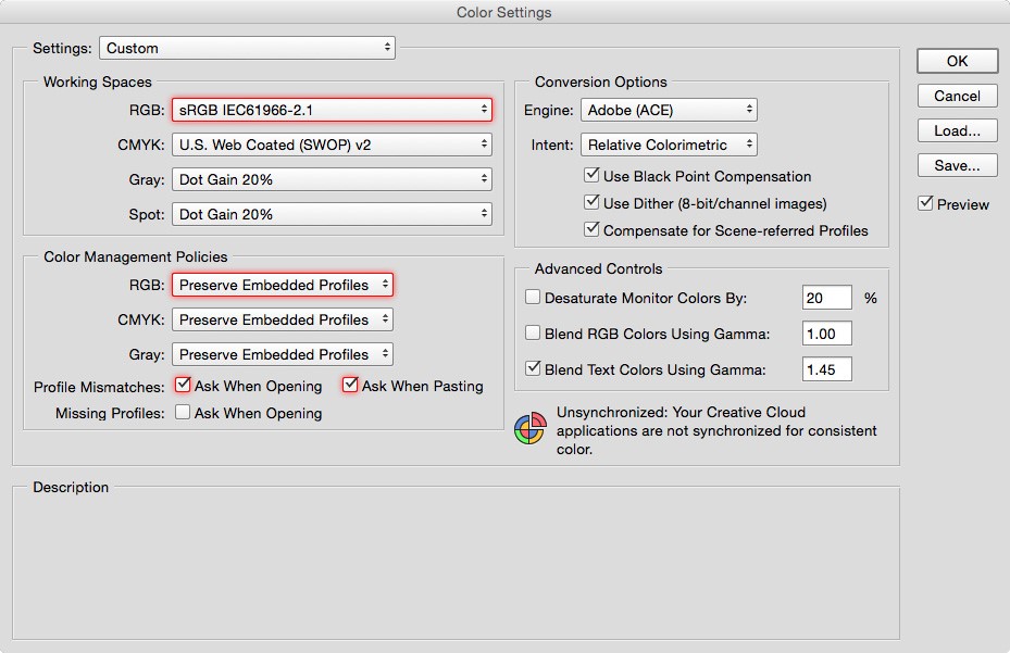
We would recommend the following colour settings within Photoshop (Edit > Colour Settings..).
- Working Spaces:RGB: sRGB IEC61966-2.1
- Color Management Policies:RGB: Preserve Embedded Profiles
- Profile Mismatches:Ensure Ask When Opening and Ask When Pasting are both checked.
STEP 3 – ORDER TEST PRINTS
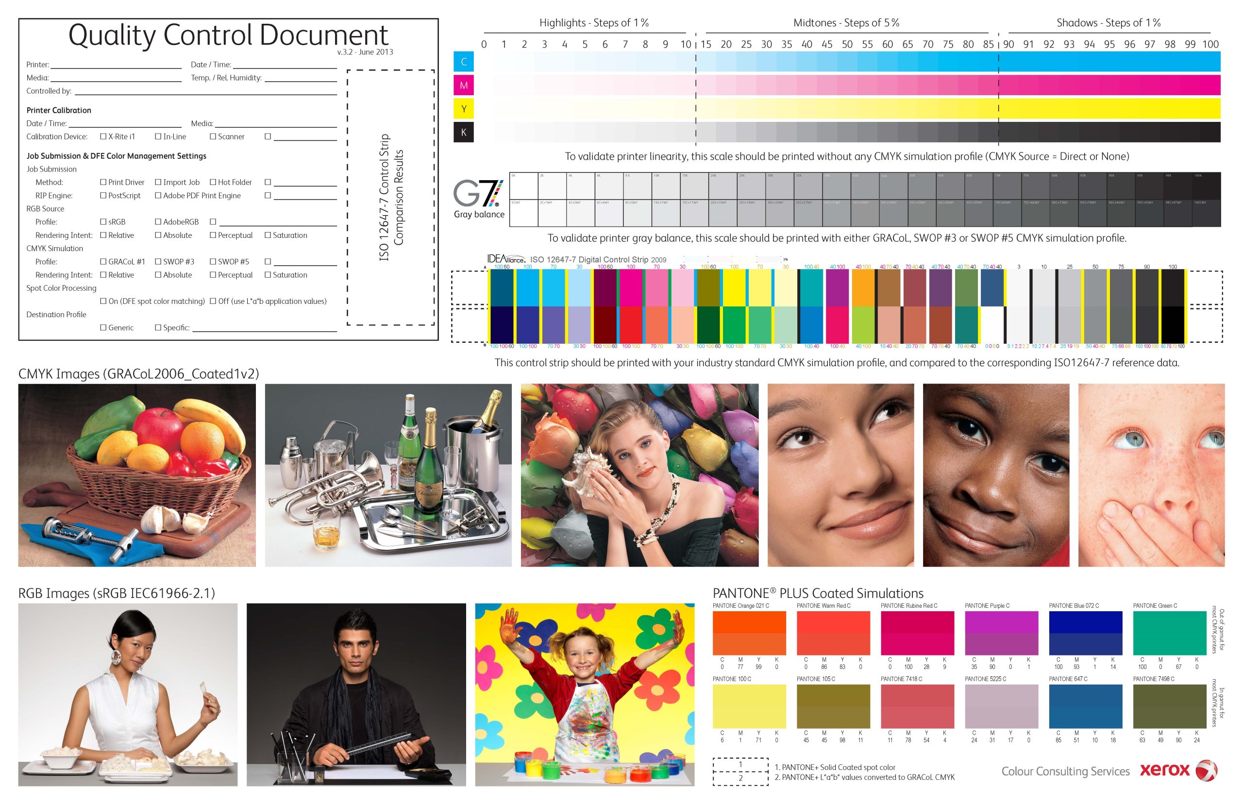
An essential part of the overall colour management process at this stage is gauging how near/far your monitor is to our print outputs, and to help with this we offer a free test print service. For best results, submit a test print order containing a range of images which cover a wide spectrum of colours. We also recommend you include a B&W image, as these can help with any density adjustments you may need to make.